Al-Akhdar Hayah
Turning fear into something you can actually do
- Client
- Al-Akhdar Hayah
- Sector
- Public awareness campaign
- Role
- Campaign identity and art direction
Most environmental campaigns tell you the planet is dying. This one tells you what to do on the way home.
Shown as portfolio work — client details available on request. This reworks an earlier version of the campaign rather than starting from a blank page.
The brief
الأخضر حياة — Al-Akhdar Hayah, “green is life”. A public awareness campaign connecting environmental care to one simple idea: the planet’s future is in our hands, and every green act is a step toward saving it.
The campaign line carries it: كل خطوة خضراء… حياة أكتر — every green step, more life.
The whole deck is in Arabic, and that is not incidental. This is a campaign for Egyptian streets, phones and roadsides, written in the language it will be read in — which makes it the clearest evidence in this portfolio of Arabic as the language work is originated in rather than translated into.
The idea
Turn fear into hope you can act on.
The category default is catastrophe: melting ice, dying reefs, a countdown. It produces guilt, and guilt produces nothing. The voice here is deliberately the opposite — positive, close to people, and always ending in something a person can do this week.
One symbol, three layers
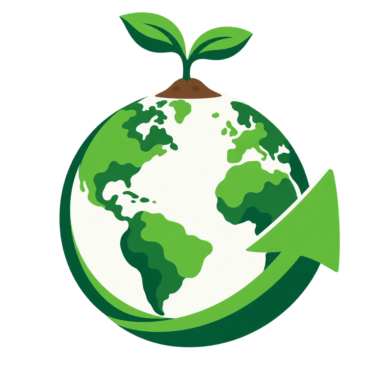
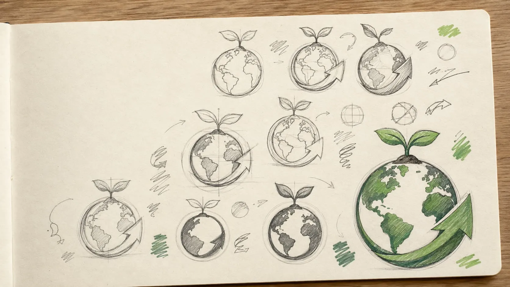
Three ideas in one mark:
- الأرض — the earth, the shared space everyone is responsible for
- النبتة — the sprout, a new beginning that can still grow
- سهم التجدد — the renewal arrow, a continuing action rather than a single gesture
The third is the one doing the work. Earth and sprout are the category’s common currency; the arrow is what turns a picture of a problem into a picture of a cycle.
A palette and a voice
Four greens run from a deep forest through emerald and leaf to a bright lime, warmed by sand tones. Deep green carries the authority, the lighter greens carry the hope, and the sand keeps it human rather than institutional.
Type is Cairo — ExtraBold for headlines and messages, Regular for detail. Clarity, warmth and direct action, in a face designed for Arabic rather than adapted to it.
The graphic language extends the idea: leaf veins redrawn as a city network, so the connection between the natural and the built is made visually rather than stated.
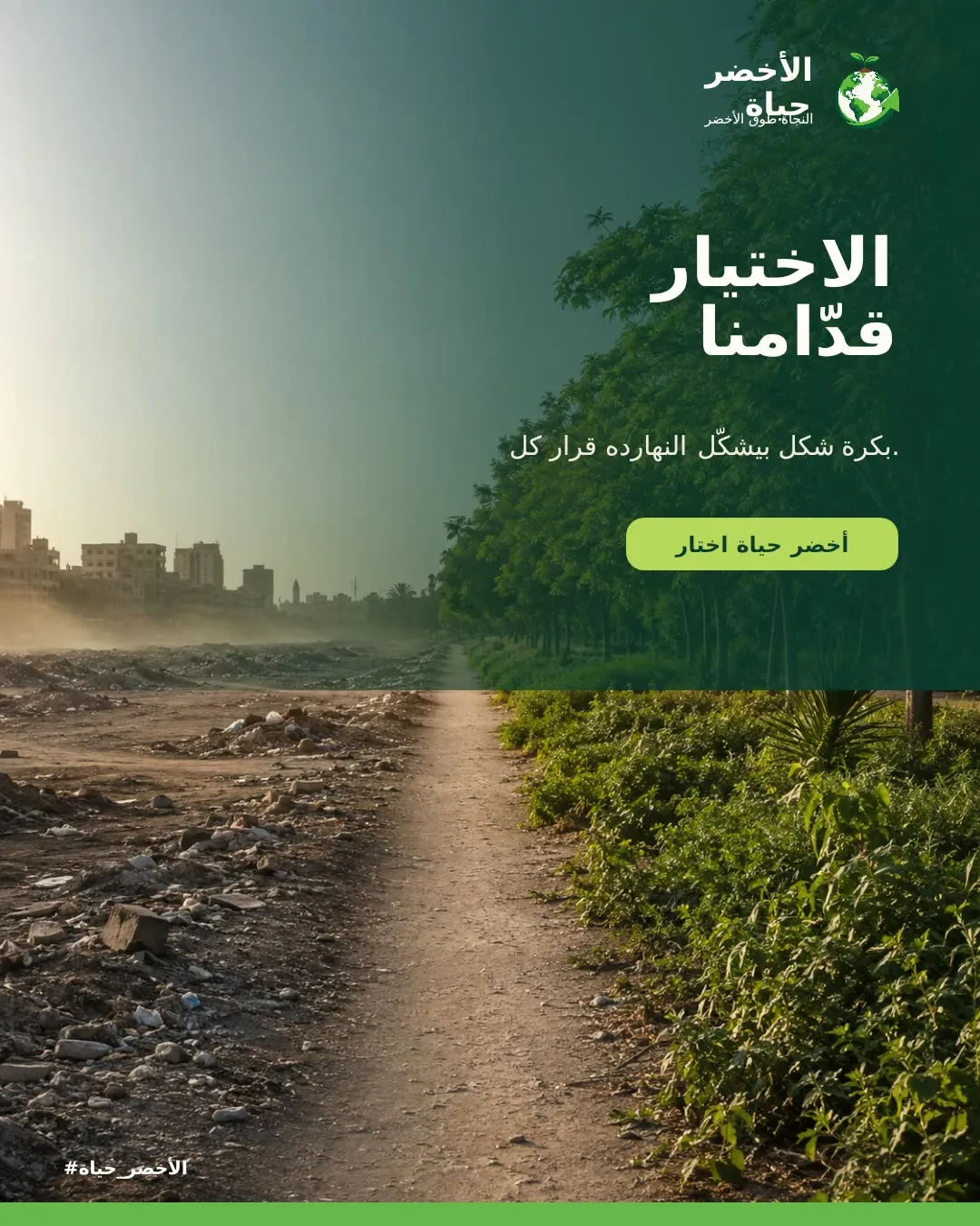
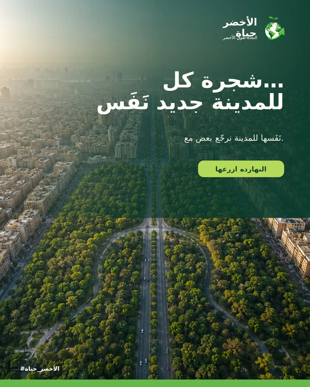
From awareness to action, in three tiers
The message system is the most transferable thing here. One tone, three levels, so the campaign can be repeated without losing its character:
- AWARENESS — the ownership message
- MOTIVATION — the reason to care
- ACTION — the specific thing to do
Every piece sits at one of the three, which is why the campaign can run for months without either repeating itself or drifting.
Where it lives
Merchandise chosen so the object argues the point: seed paper, a recycled notebook, a cotton tote and a reusable bottle. A campaign about waste printed on things that create waste undermines itself, and this one does not.

Then out to the street, where the same system has to work at a completely different distance and reading speed.
At the far end of the scale is a bridge banner at an 8:1 ratio — one large sentence, three short verbs, and the mark anchored at the end.
What shipped
A symbol, a four-green palette, an Arabic type system, a graphic language derived from leaf structure, a three-tier message framework, merchandise on materials that support the message, three social formats, a Facebook cover, a roadside billboard and a bridge banner.