Naqaa Al Ain
Clarity, made into a system
- Client
- Naqaa Al Ain
- Sector
- Optical retail
- Role
- Naqaa Al Ain for Optics
- Dates
- Jan 2023 – Dec 2023
Clarity is what an optician sells. So clarity became the system, not the slogan.
The brief
Naqaa Al Ain sells eyewear and optical care, and it was speaking in two voices. The retail side wanted fashion. The clinical side wanted reassurance. Nothing connected the shelf, the consultation room and the shopfront.
The task was one coherent language across all three — modern enough for young professionals choosing frames, reassuring enough for a family booking an eye test.
The trap in a brief like this is the obvious compromise: go clinical and lose the fashion buyer, or go fashion and lose the trust that makes someone hand over their eyesight. Neither half could be sacrificed to the other.
The idea
Clarity becomes the system.
Not clarity as a claim in the copy — clarity as the thing the identity is physically made of. Open forms, generous space, calm contrast, and a mark you can still read at the size it appears on a spectacle arm.
It is the rare case where the functional promise and the visual language can be the same thing, and the whole system follows from taking that literally.
The mark is an Arabic letter, not a picture of an eye
The obvious route for an optician is to draw an eye. It is also why every optician looks the same.
Instead the symbol is built from the ع — the ayn that opens العين, the brand’s own name, and the Arabic word for eye. Two equal circles share a single vertical axis; their open terminals form the letter’s gesture. Read one way it is a letter. Read another it is two lenses on an optical bench.
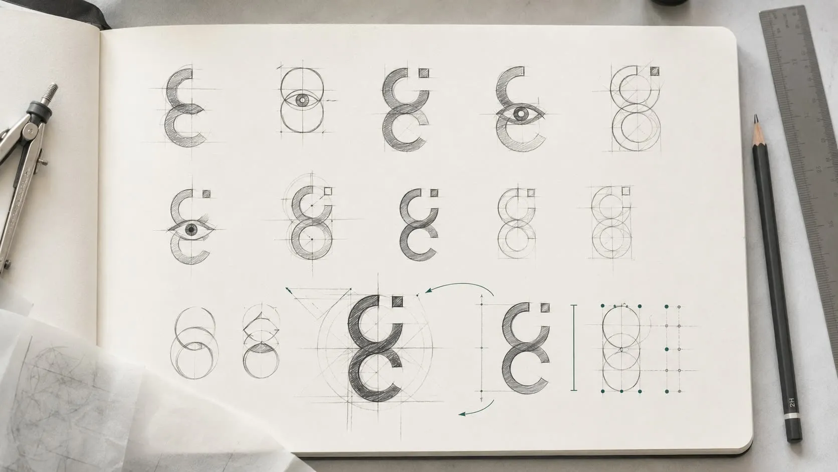
This is the part worth pausing on for anyone who has commissioned bilingual work. The mark is not a Latin symbol with Arabic set underneath it. It originates in the Arabic letterform, which means the Arabic lockup is the natural one and the Latin lockup is the adaptation — the opposite of how most regional identities are built, and the reason this one does not look imported.

Construction, not decoration
The circles are equal and share one axis, so the mark can be rebuilt from a rule rather than from a file. Clear space is defined by the symbol’s own width, which means it scales without anyone having to remember a number.
Minimum sizes are specified in both directions it actually gets used: 120 px wide on screen, 28 mm wide in print.
Those two numbers are the difference between a logo and a system. They are what stops the mark being set at 40 px on a booking confirmation by someone who never saw the guidelines.
Two scripts, equal weight
DIN Next Arabic for Arabic. Montserrat for Latin.
Both are chosen for the same reason — geometric, open counters, legible small — so that a line of Arabic and a line of English sit at the same optical weight instead of one shouting over the other. On a bilingual shelf talker, that is the entire job.
The palette runs five tones from a near-black deep ink through the brand teal to a light optical aqua: authority at one end, clarity at the other, and enough range in between that packaging, signage and social do not all have to look identical to look related.
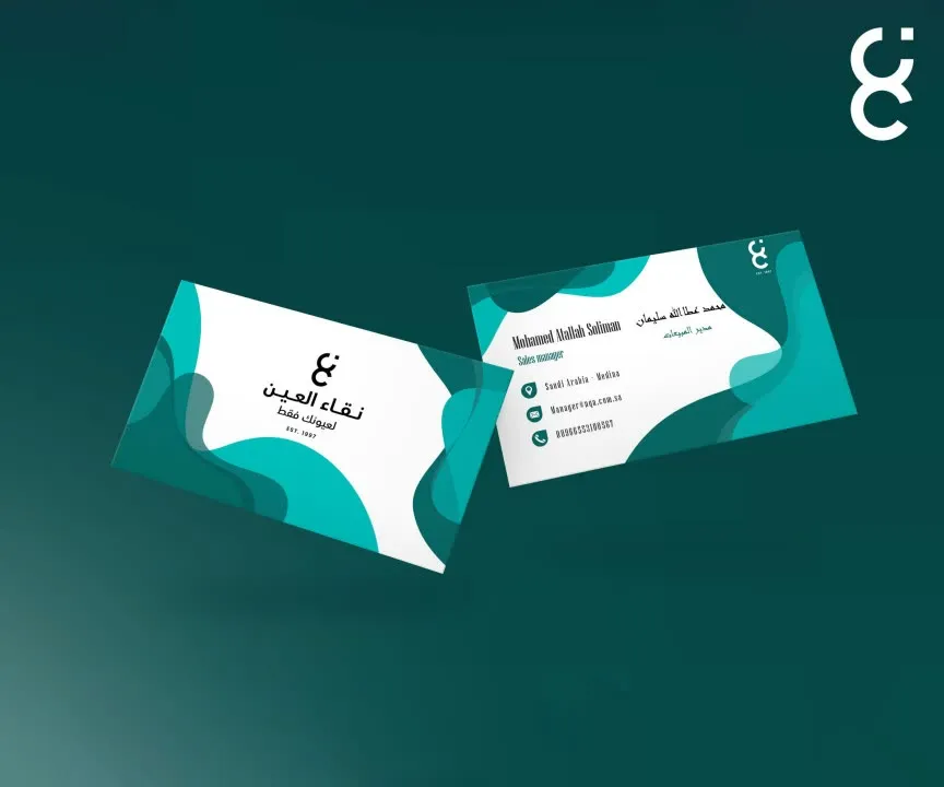
Where it lives
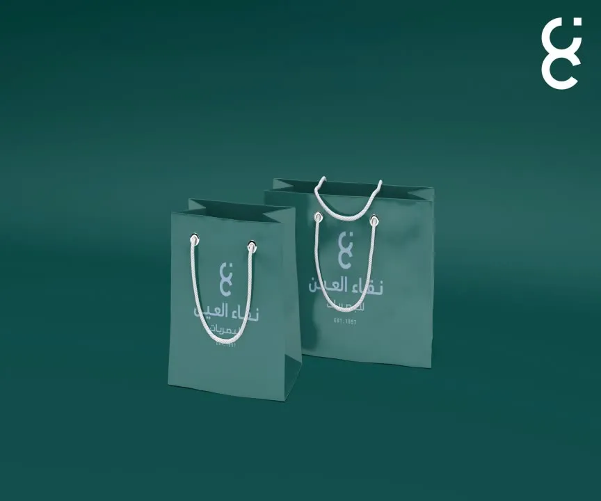
An identity for a retailer is only real once it survives contact with a shelf, a shopfront and a courier bag.
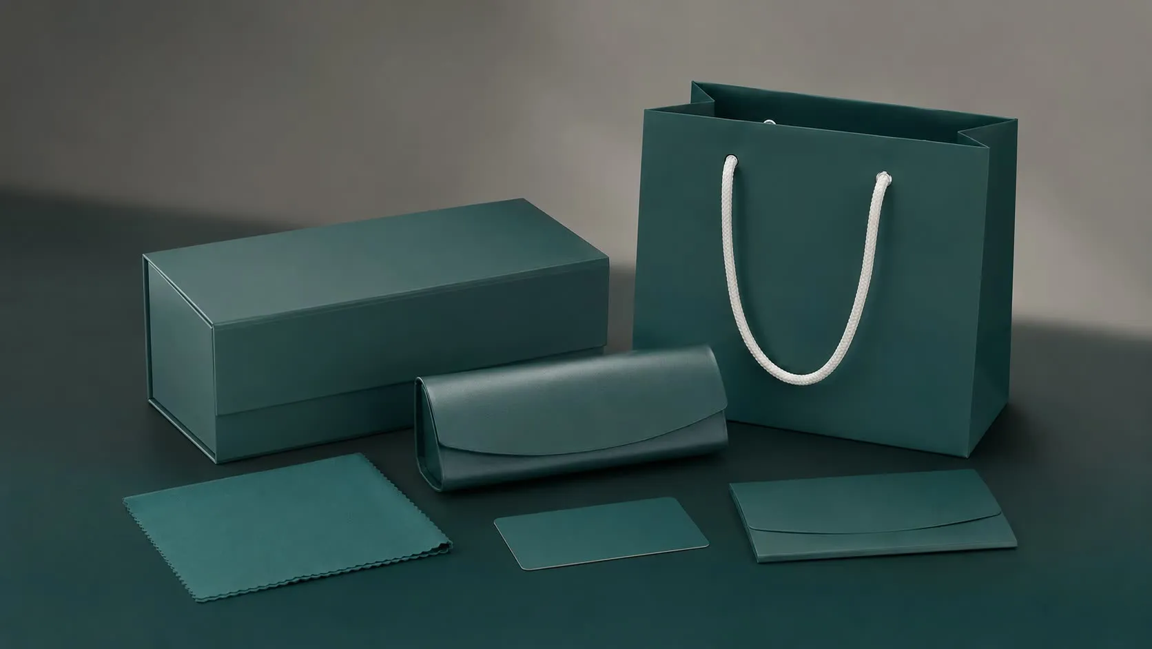
The packaging is built as a sequence rather than a container — a rigid box that opens to a structured reveal, with the protective layer doing the presenting rather than being hidden underneath.

Staff uniforms carry the system into the room where the actual consultation happens — modest silhouettes, breathable tailoring, and a silver piping detail that reads as clinical precision rather than corporate uniform.

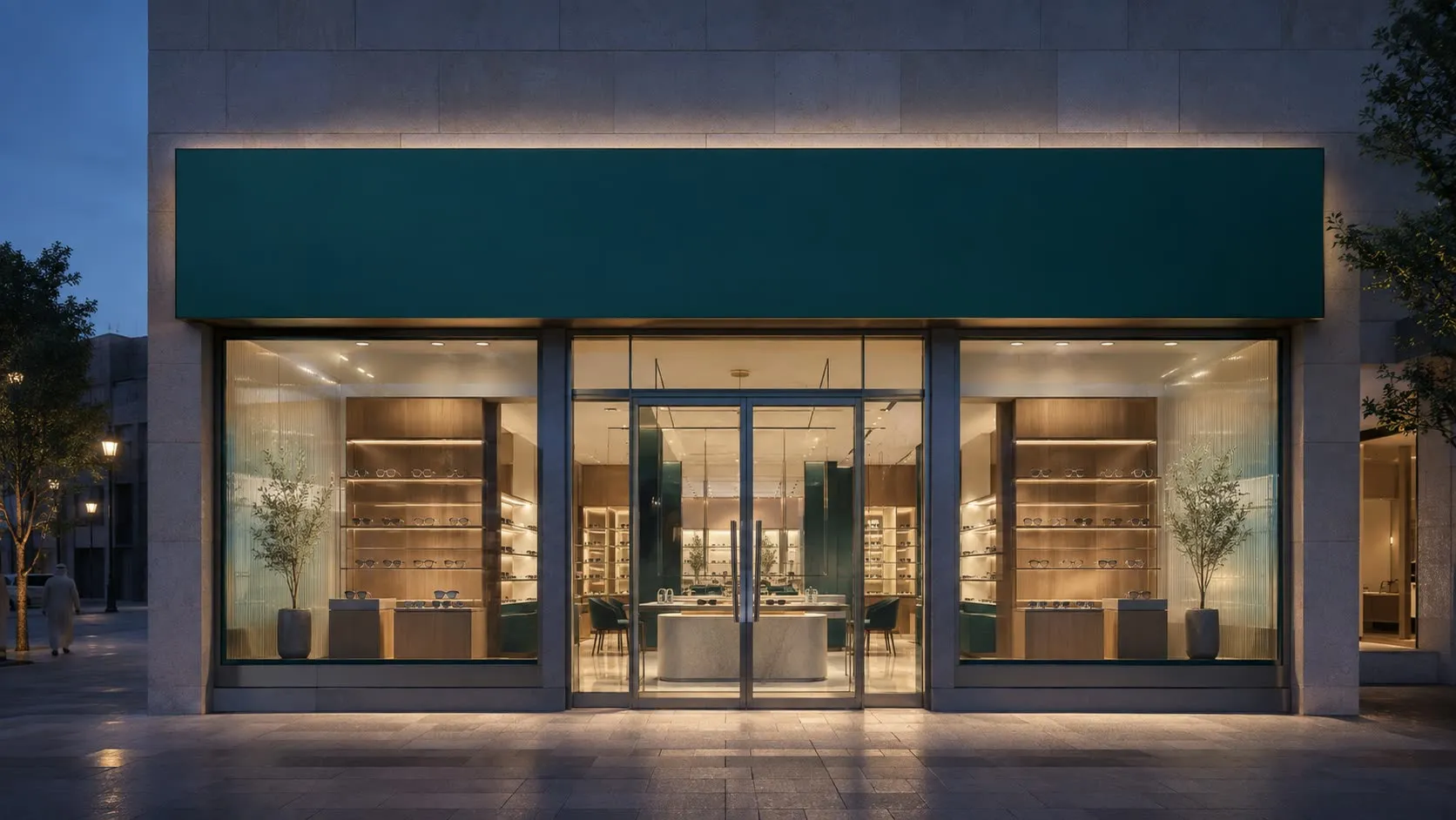
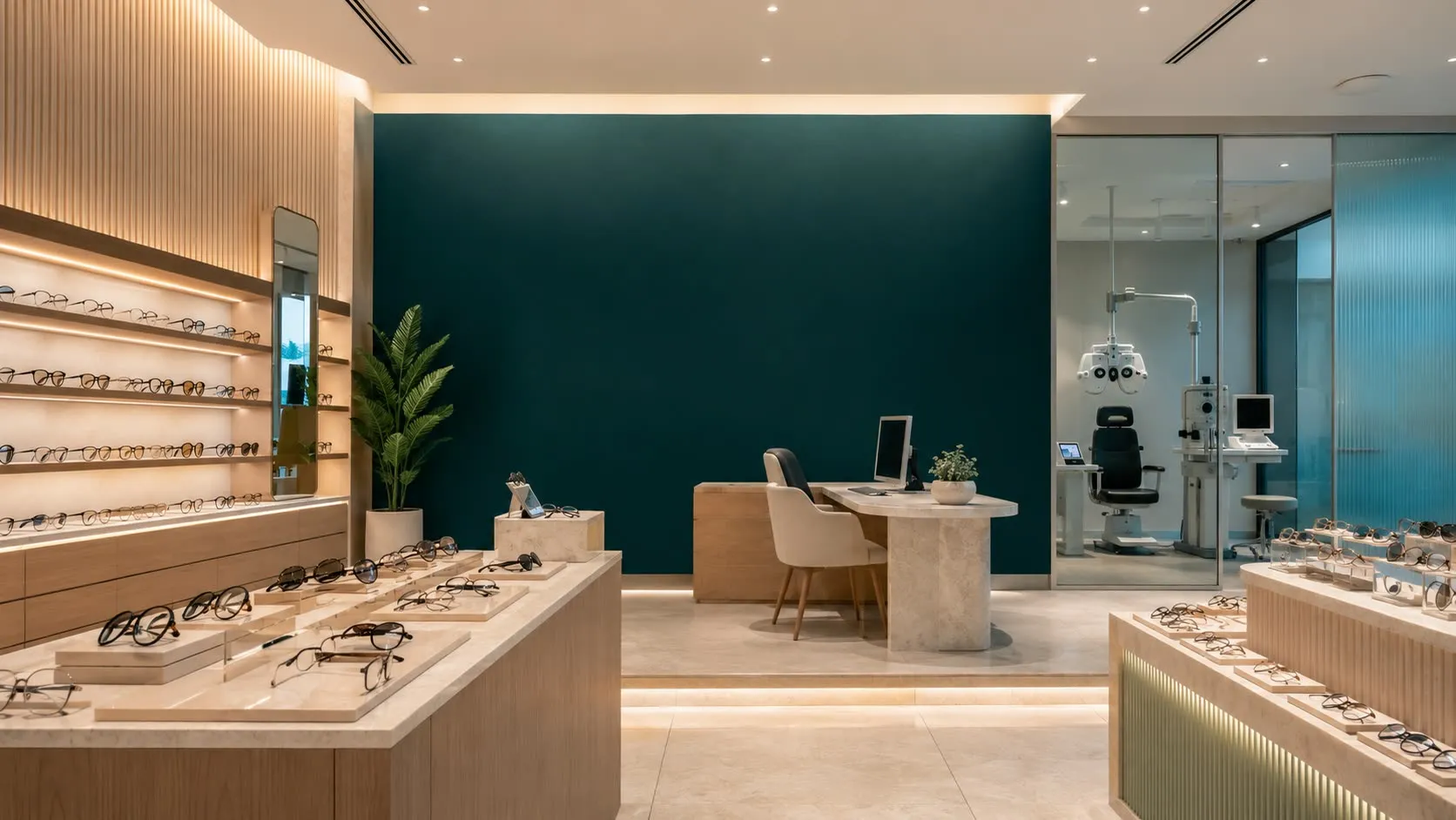
The social system is built as three repeatable formats rather than a set of one-off posts: product on its own, product on a person, and the collection as a group. Same optical language, three jobs.


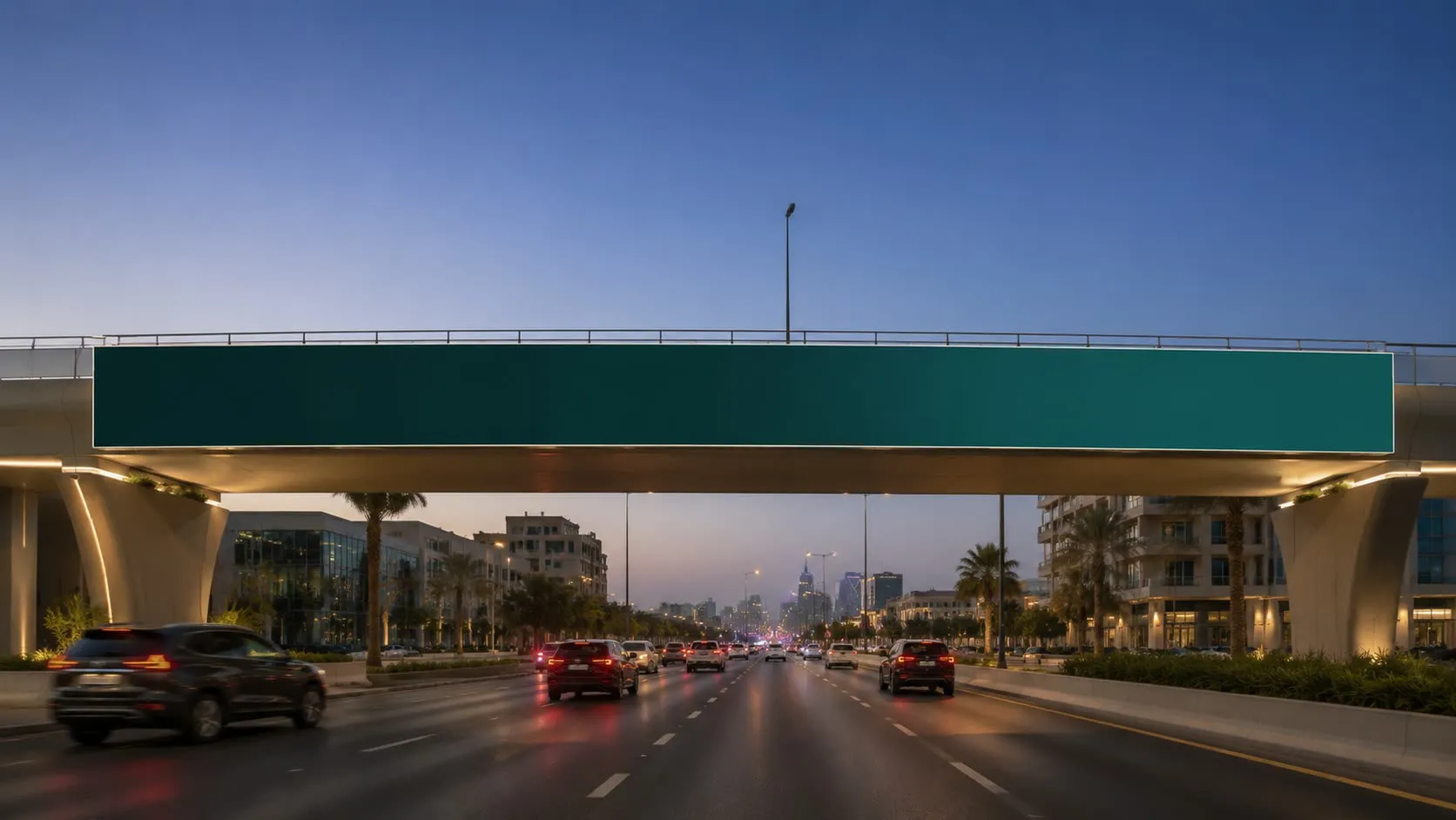
At the other end of the scale, the same system has to work at eighty kilometres an hour.

What shipped
A complete identity system: symbol and construction rules, a bilingual type system, a five-tone palette, and an authored guideline set covering the lockup family, clear space and minimum sizes — extended into packaging, retail environment, uniforms, social and out-of-home.