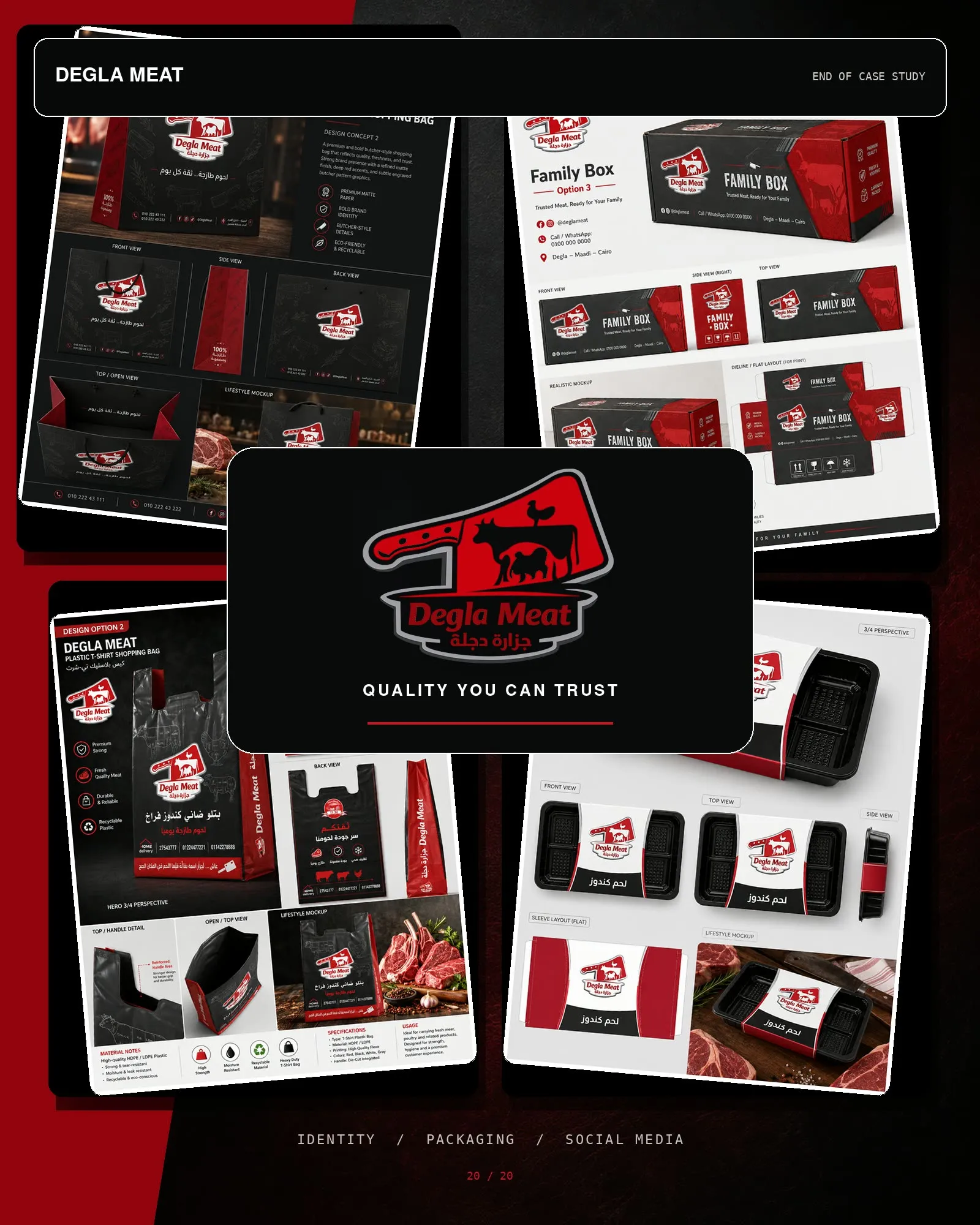
Degla Meat
Making freshness visible
- Client
- Degla Meat
- Sector
- FMCG — meat retail
- Role
- Identity, packaging and campaign design
A butcher's brand has one job before any other: look like the meat is fresh.
Shown as portfolio work — client details available on request.
The brief
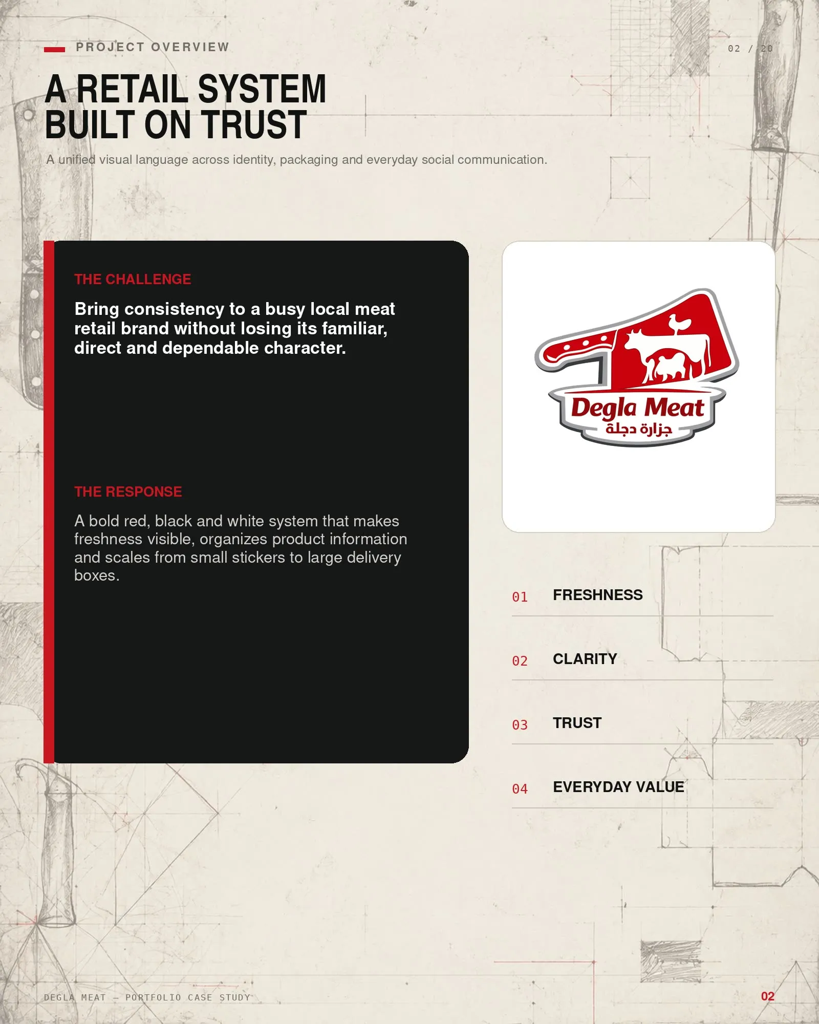
Degla Meat is a working butcher — high turnover, walk-in trade, delivery. The brand already existed and already worked in the way that matters: customers recognised it and trusted it.
The task was to bring consistency to it without losing the familiar, direct and dependable character it already had. That constraint is the whole job. A rebrand that makes a neighbourhood butcher look like a design studio’s idea of a butcher loses the thing the business was actually trading on.
The idea
A butcher’s brand has one job before any other: look like the meat is fresh.
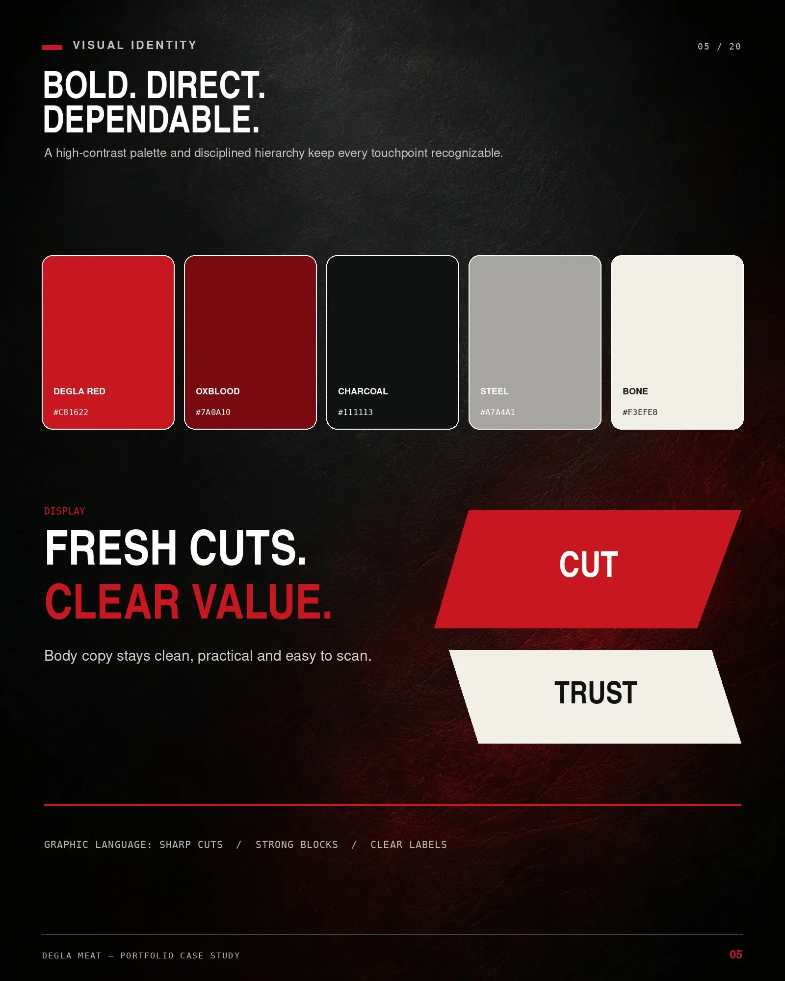
Four values run through the system — freshness, clarity, trust, everyday value — and the first one is doing most of the work. Red against black and white reads as fresh before a customer has consciously read anything.
The mark
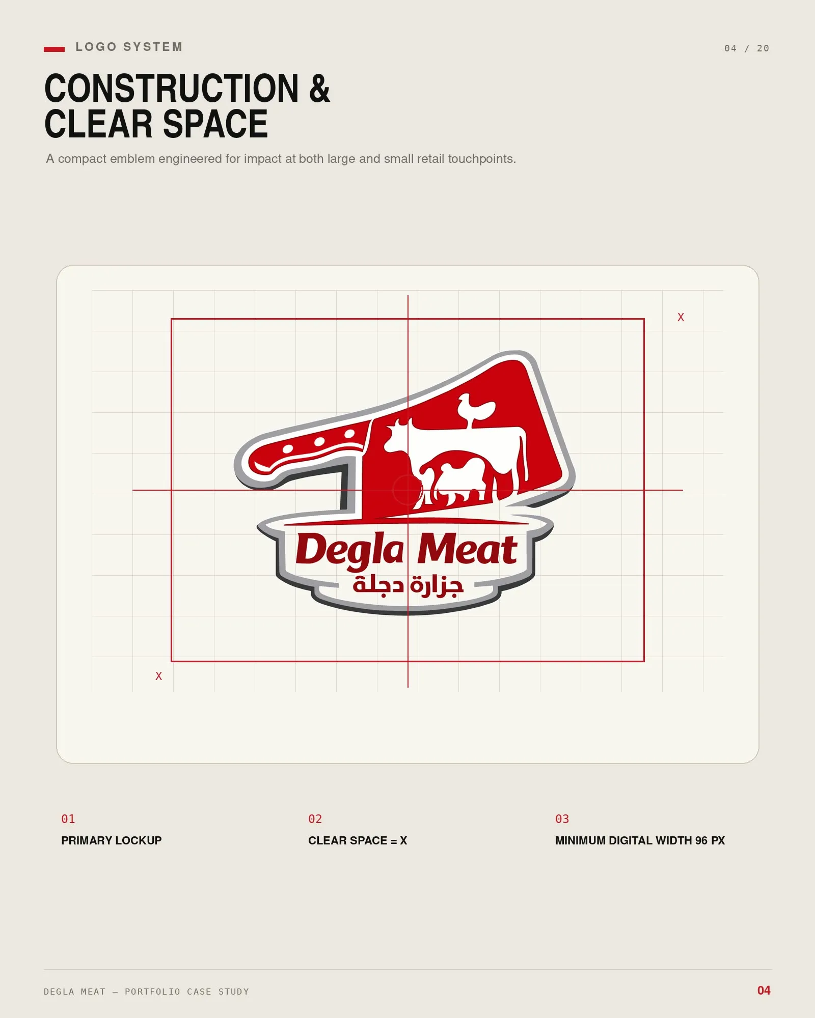
A cleaver and a cow, locked into a badge with the name in both scripts — Degla Meat and جزارة دجلة. Direct, legible at a glance, and unembarrassed about what the business does.
The system has to scale from a sticker to a box
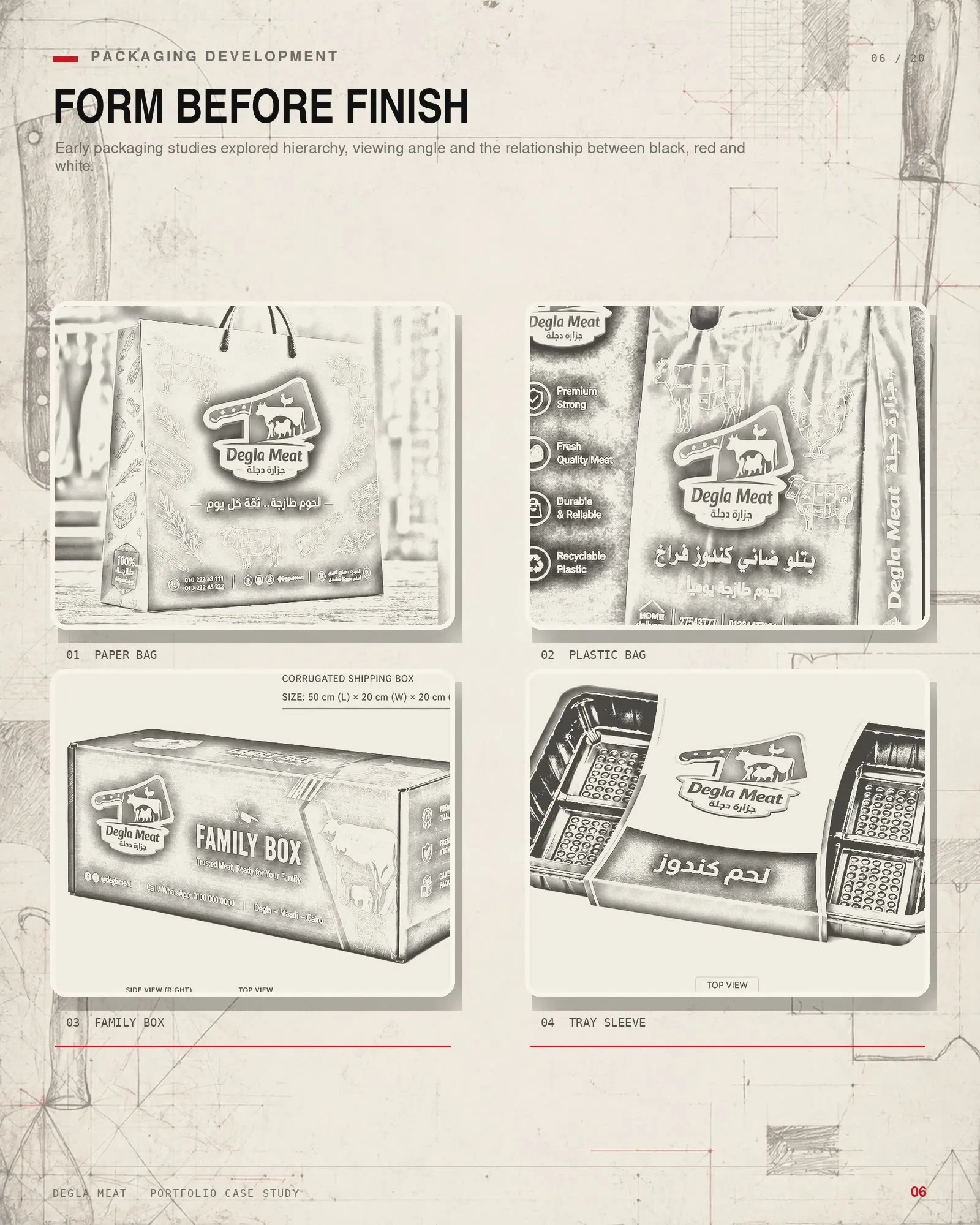
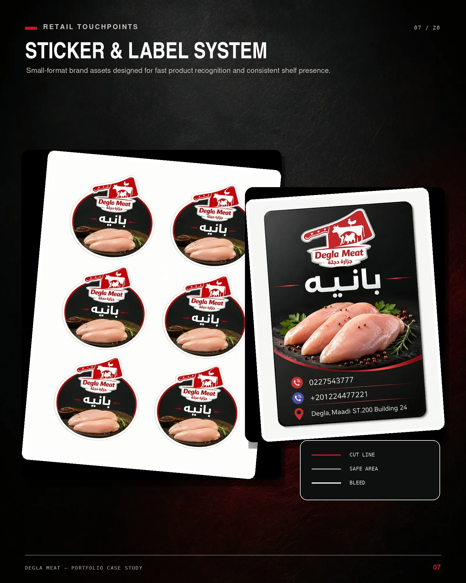
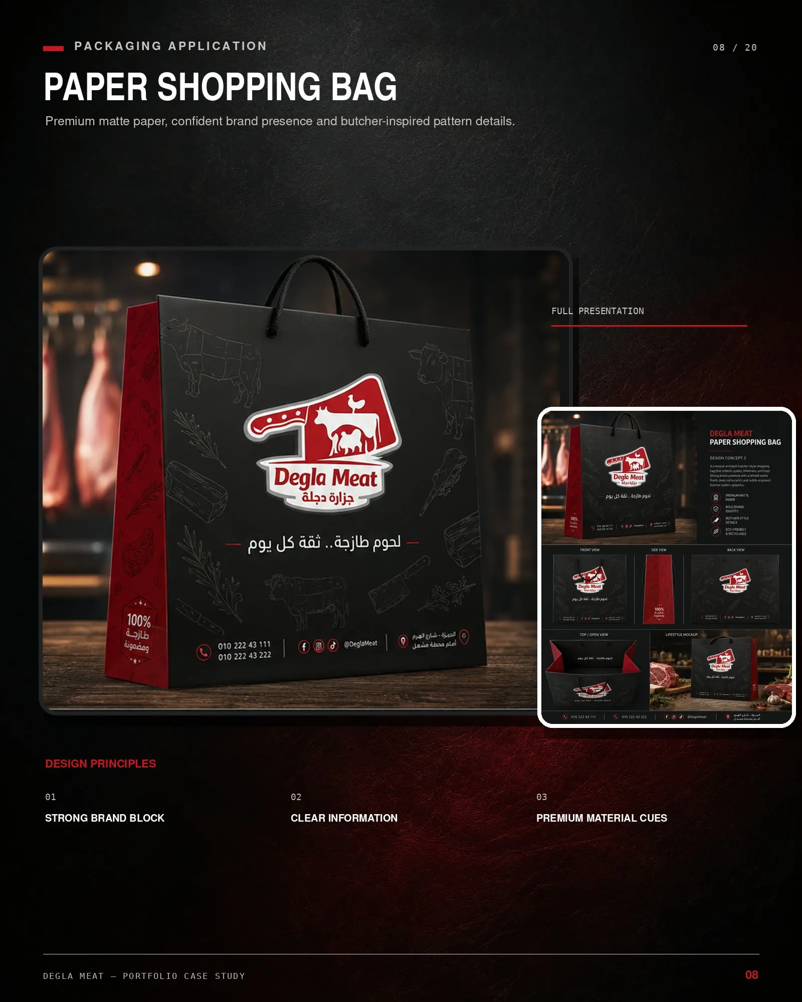
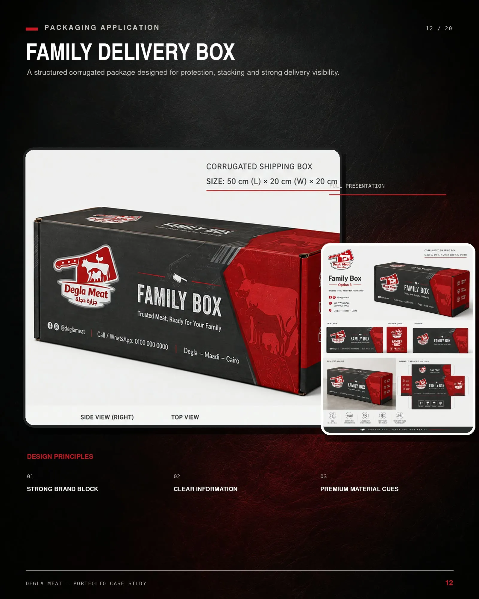
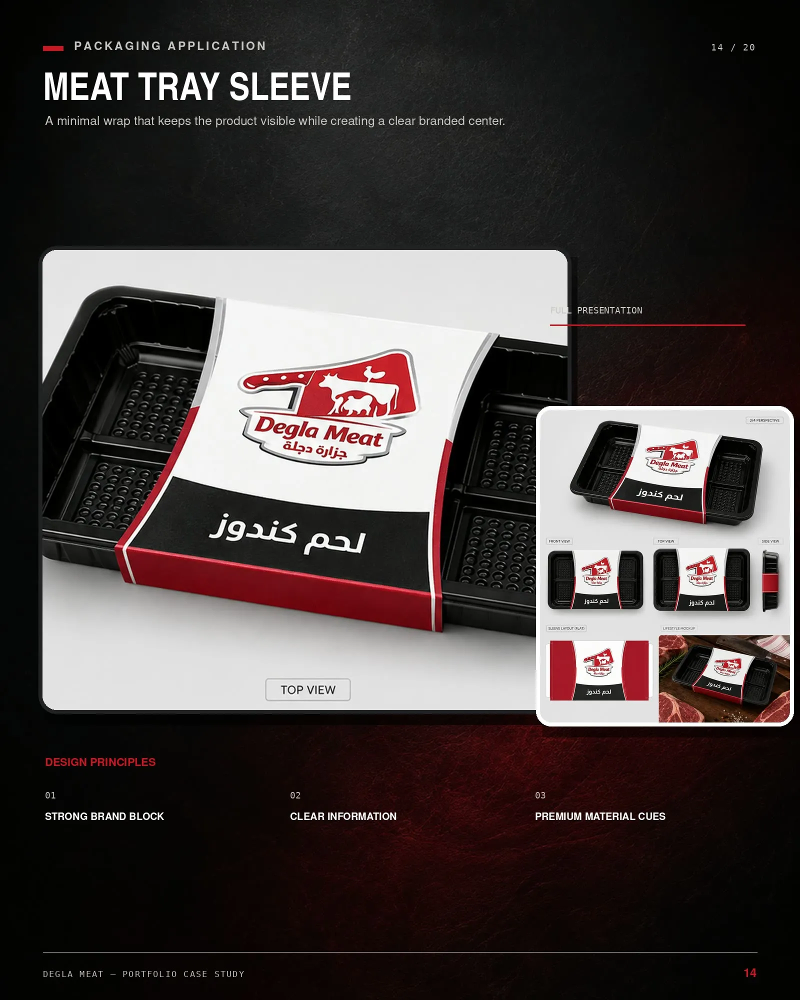
This is where a retail identity is actually tested. The same system has to survive being printed at 30 mm on a label stuck to a tray and at full size on a delivery box, on different stocks, by different suppliers.
Everyday communication, not campaign photography
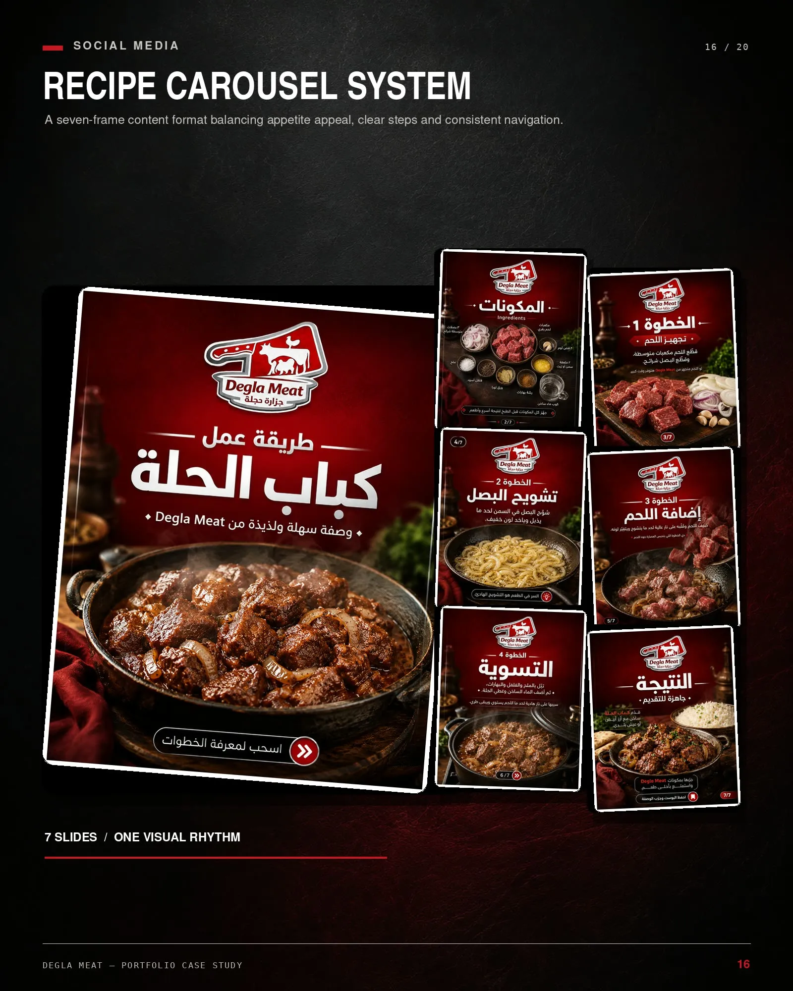
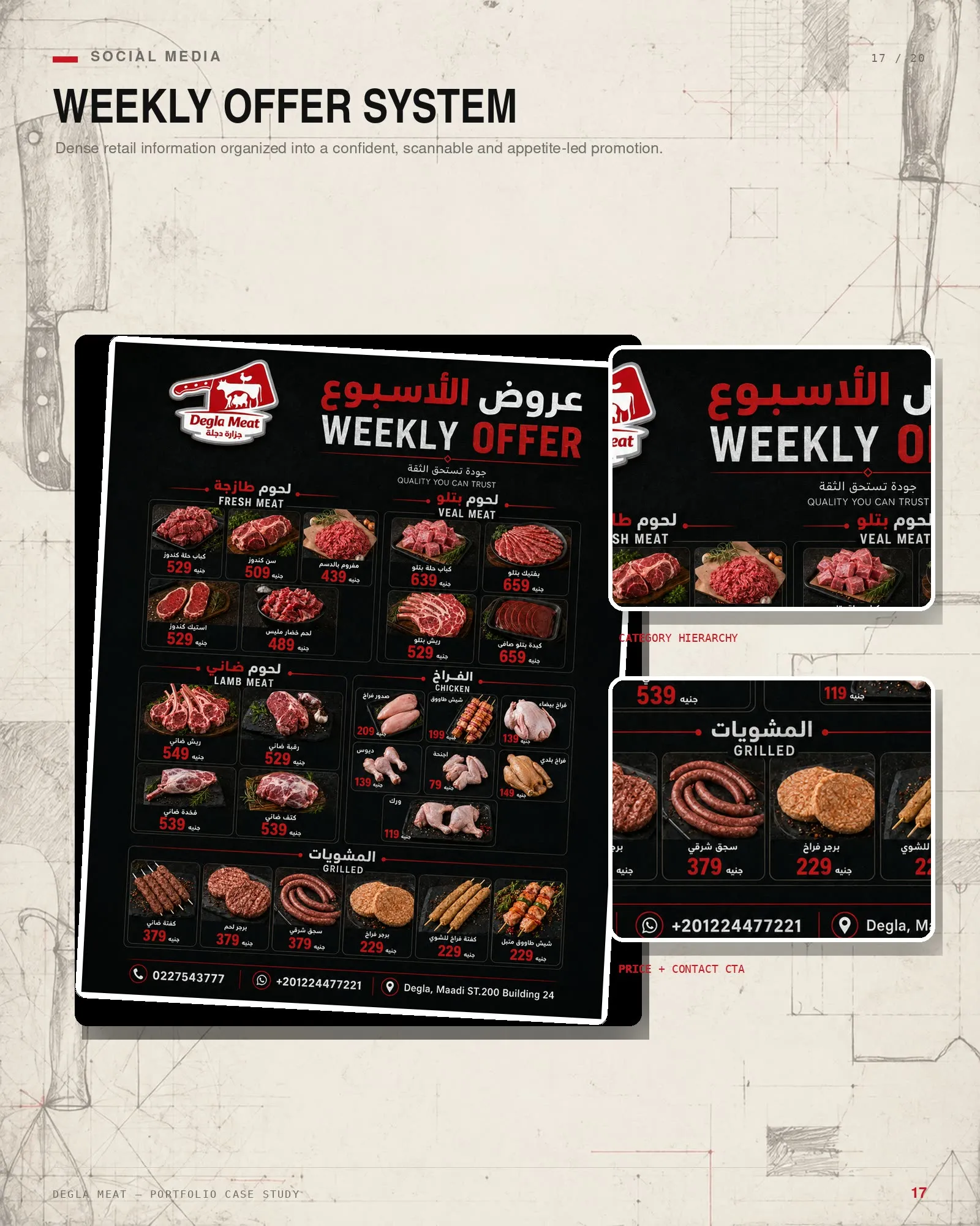
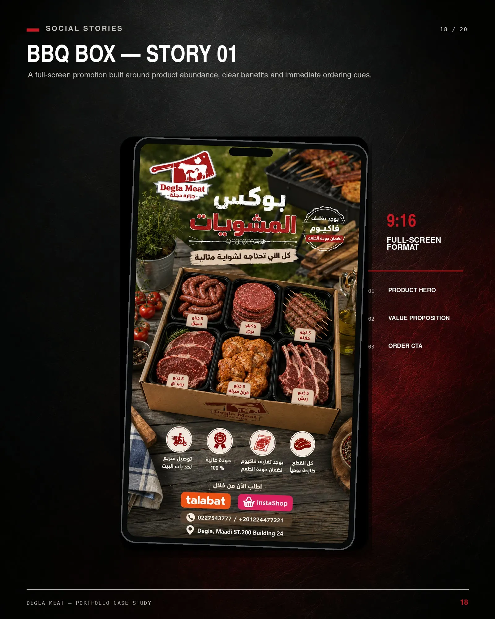
A butcher posts several times a week, forever. So the social system is built to be filled in rather than art-directed each time: a recipe format, a weekly offer format, and a story format.
What shipped
An identity, a packaging line from label to delivery box, and a repeatable social system — all bilingual, all in one red, black and white language.