Smileno
A family lives inside the tooth
- Client
- Smileno
- Sector
- Dental healthcare
- Role
- Identity design and art direction
Most dental brands look like a dentist. This one looks like the reason you go.
Shown as portfolio work — client details available on request.
The brief
A dental clinic treating adults and children, wanting one identity across both. The tension is in the category: clinical trust and emotional warmth pull in opposite directions, and most dental brands resolve it by picking a side.
Go clinical and you get the same blue-and-white sterility as every practice on the street. Go warm and you undercut the thing a patient is actually buying, which is confidence that the person holding the drill knows what they are doing.
The idea
A family lives inside the tooth.
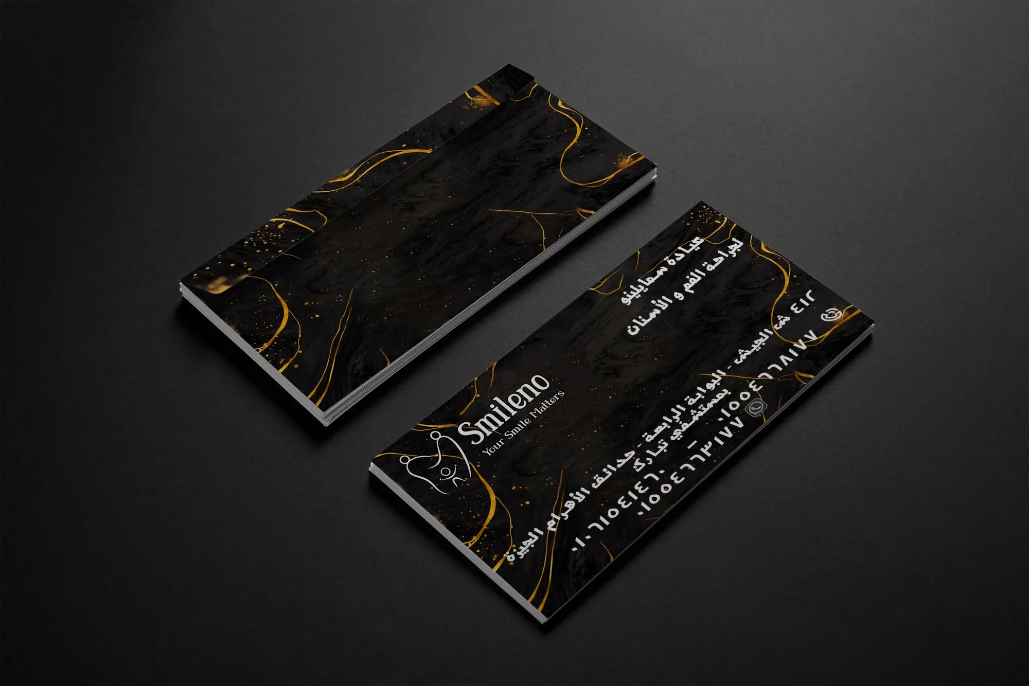
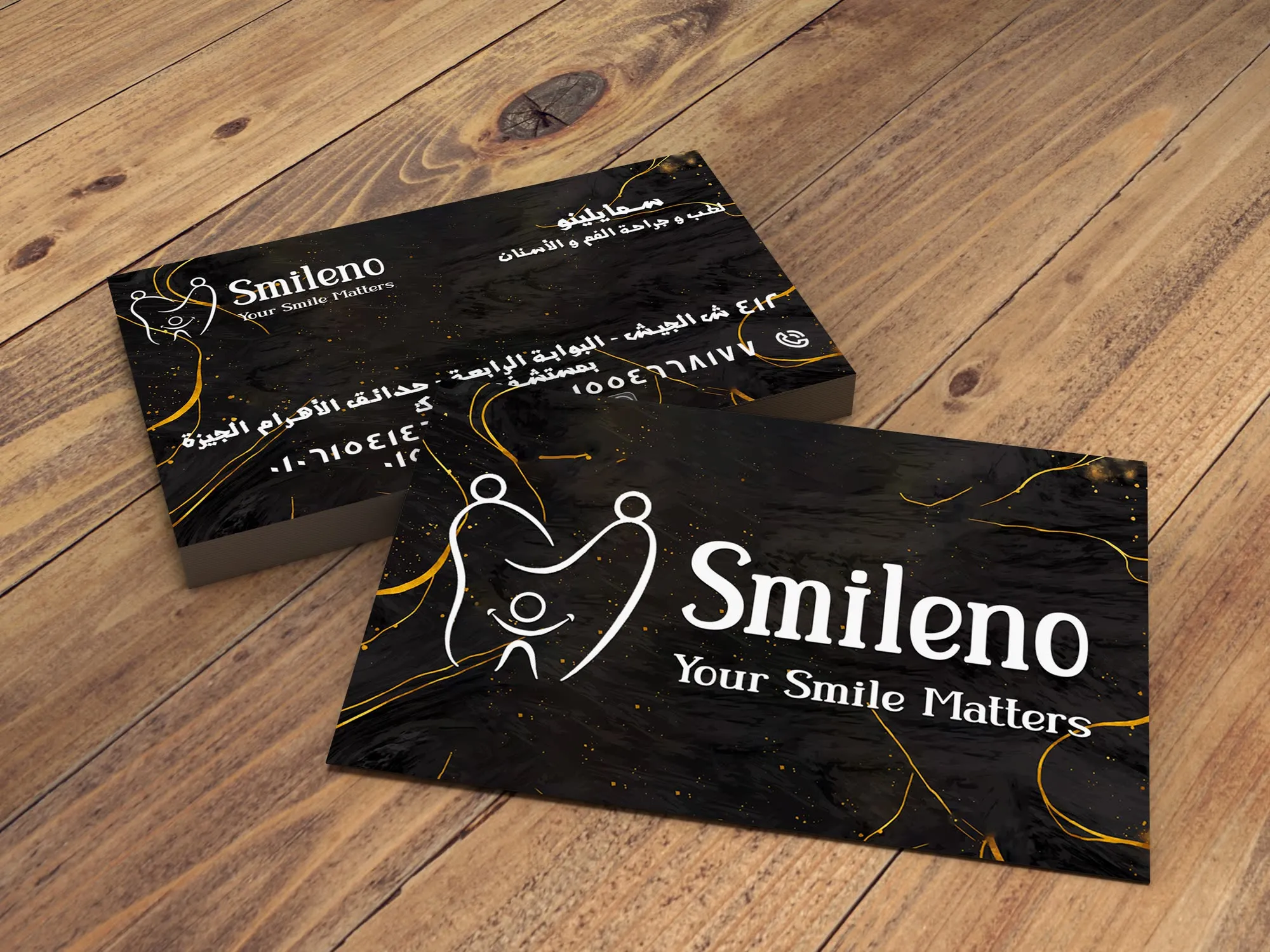
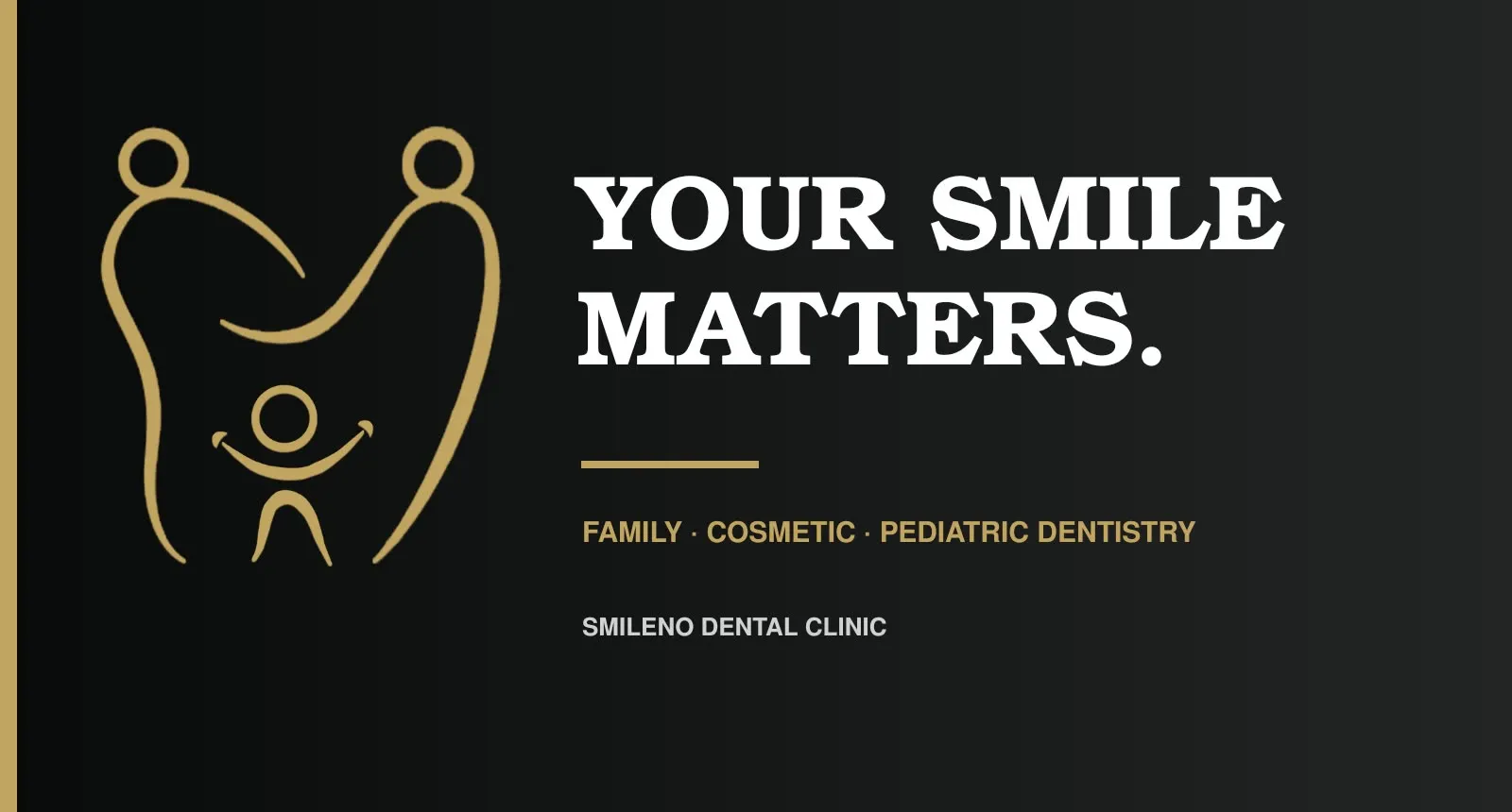
Two parent figures shape the outer silhouette. A child and a smile sit at the centre. Read one way it is a family; read another it is a molar. Neither reading has to be explained, and the second one arrives about a second after the first — which is what makes it stick.

Four ideas resolve into one mark — parents, tooth, smile, child — and the mark is drawn as one continuous gesture rather than assembled from parts. That is what keeps it away from the hard clinical geometry the category defaults to: a line that never breaks reads as protective rather than surgical.
Warmth and precision, held together
The palette does the work the symbol cannot: obsidian and champagne gold against porcelain, with a clinical grey for the functional layer. Gold on near-black is what stops a healthcare brand reading as a discount clinic, and it is doing the “premium” job so the symbol does not have to.
Typography is split by role. A warm serif leads — it carries the establishment and the reassurance — while a clear sans handles everything functional and bilingual: forms, directions, prices, opening hours.
Where it lives, which is the point
The category test for a clinic identity is not the logo. It is whether the system survives a medical history form — the least glamorous, most-used object in the building.
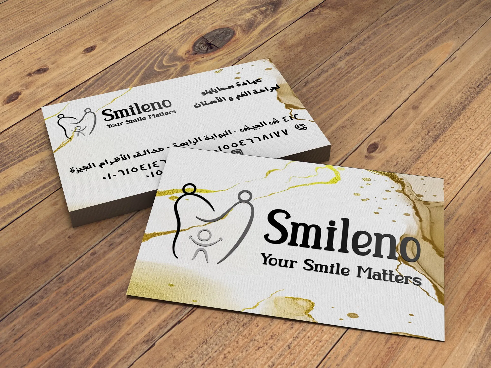
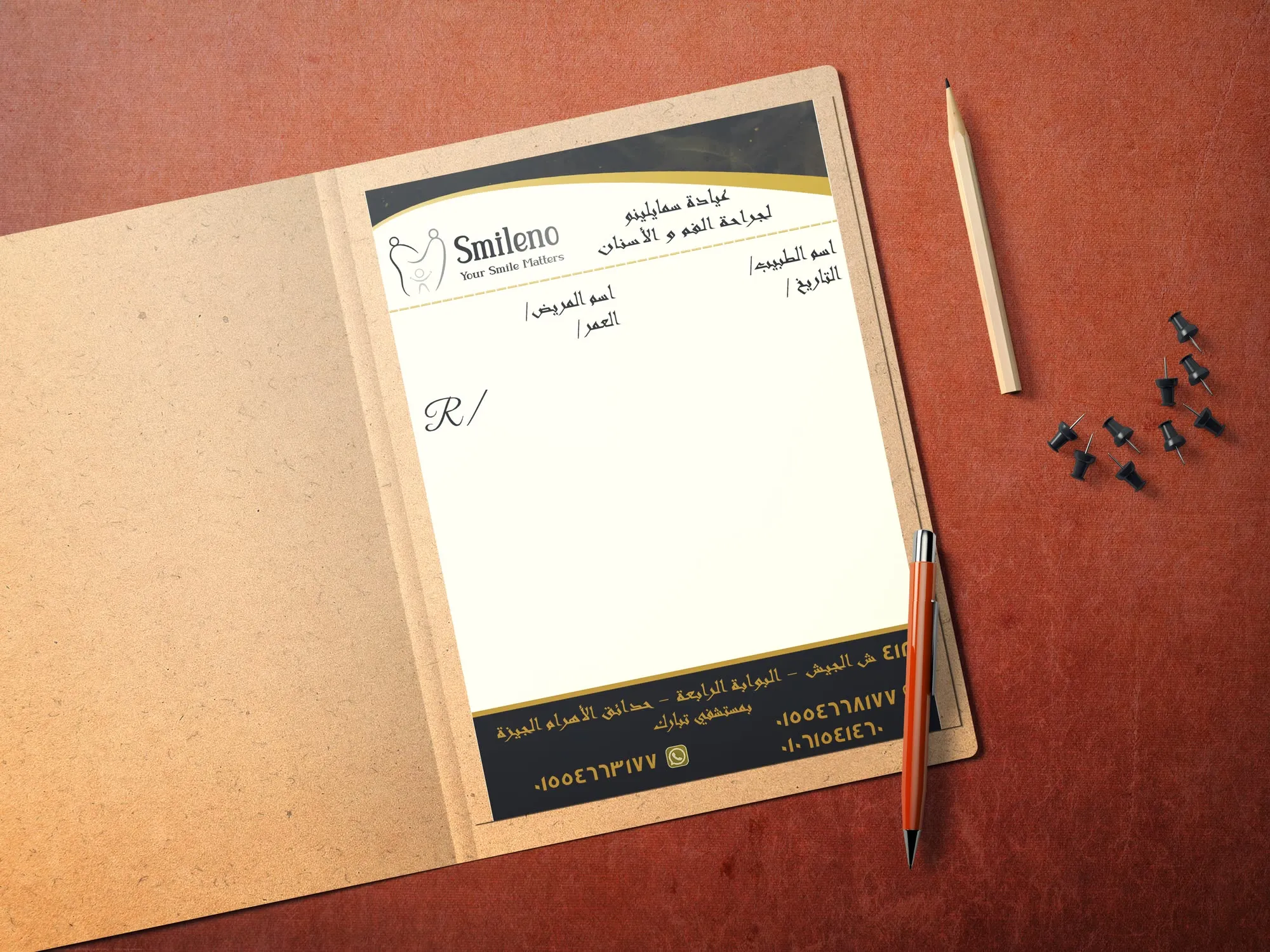
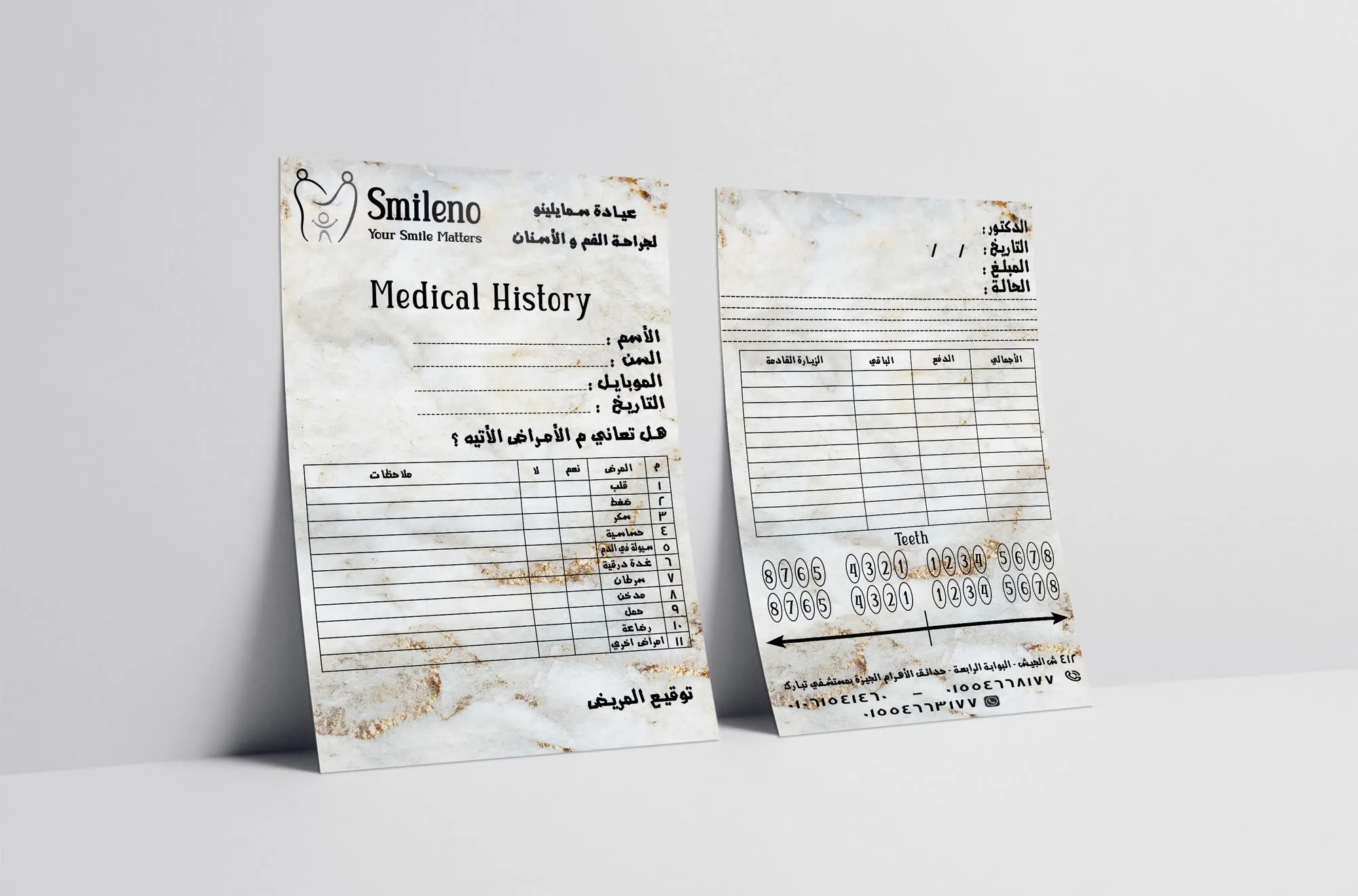
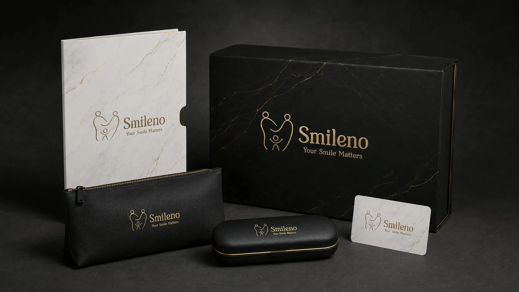
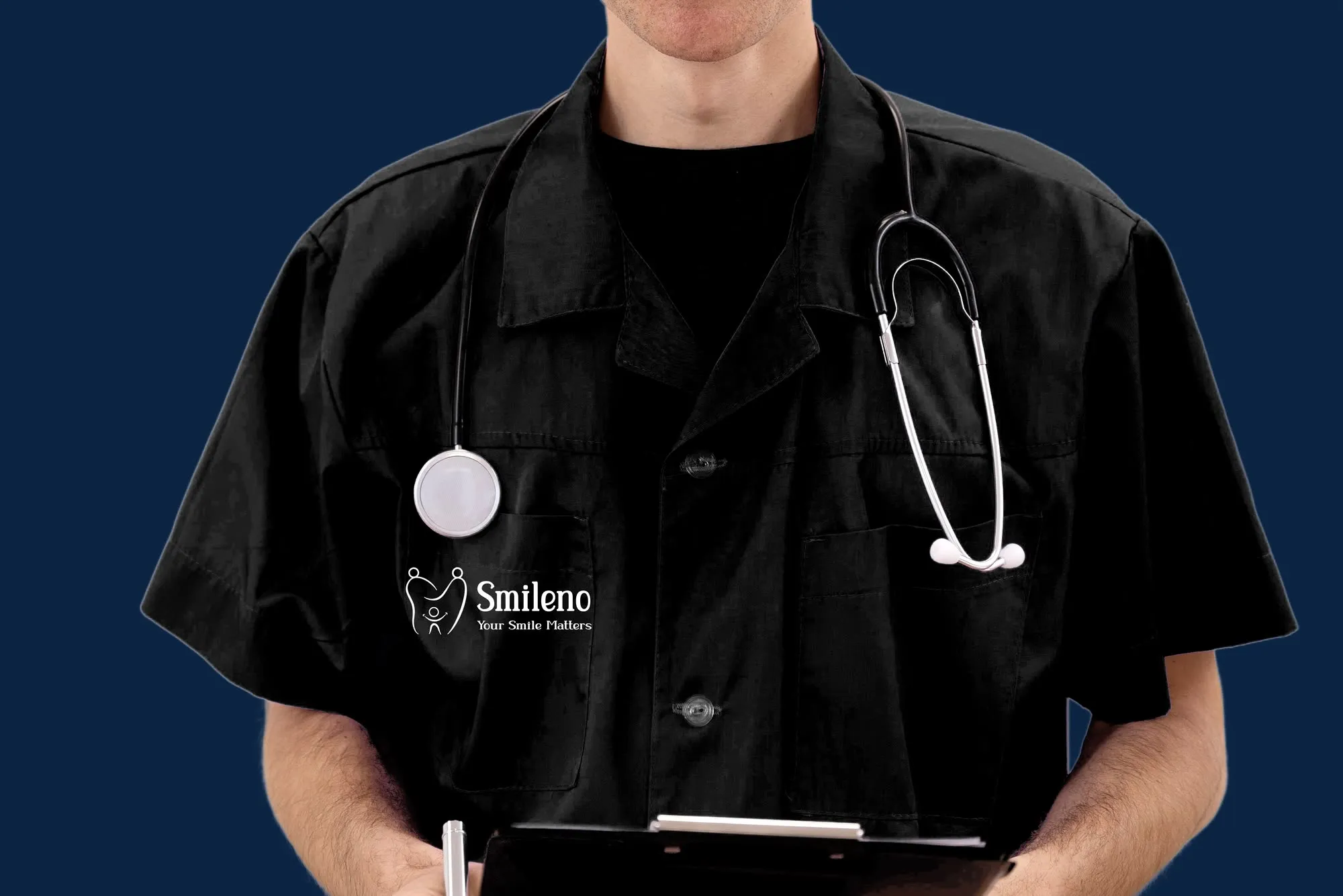
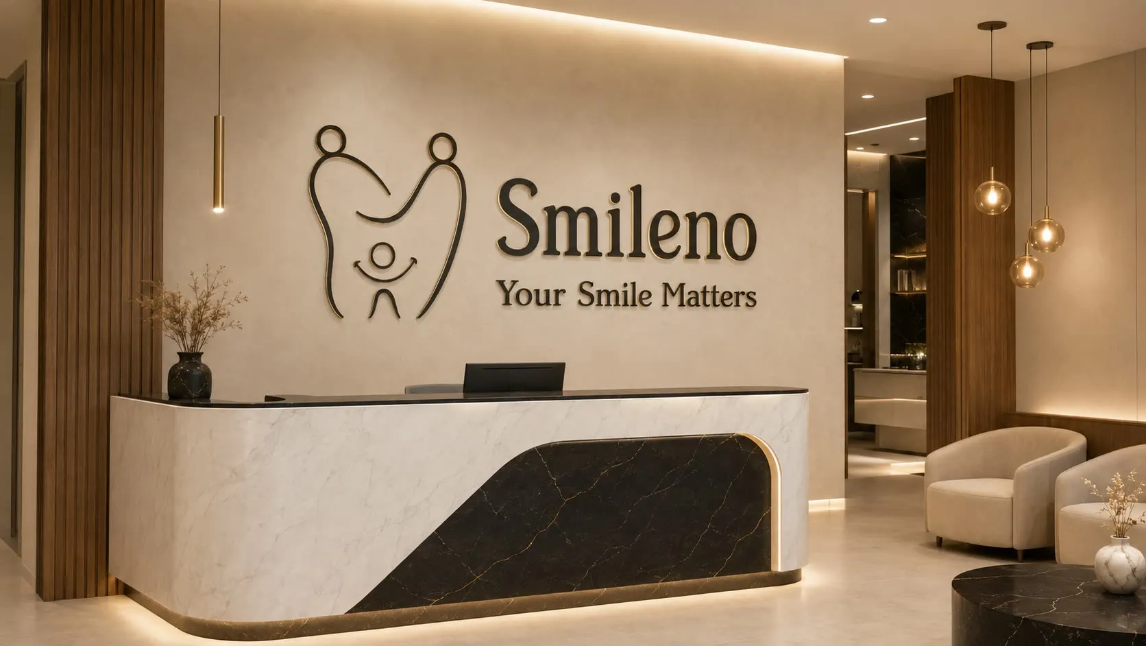
From there it runs outward: uniforms, interior signage, the reception desk, the shopfront.
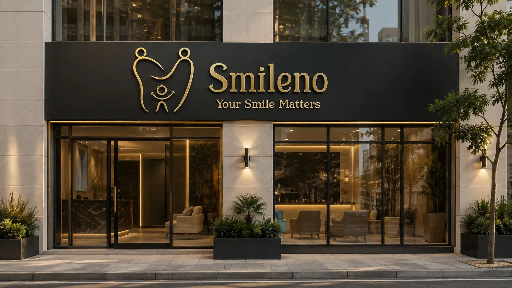
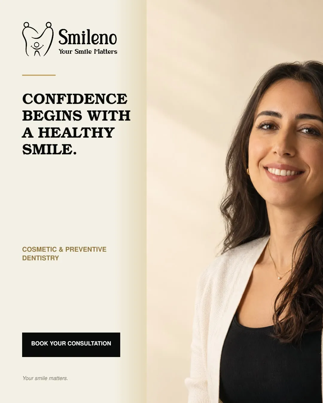
And into social and outdoor, where the same high-contrast obsidian-and-gold system has to work at a glance rather than at reading distance.
What shipped
One symbol, a bilingual type system, an obsidian-and-gold palette with a marble-and-gold device — applied across stationery, business cards, prescription pads, medical history forms, a patient welcome kit, uniforms, interior signage, reception, the façade, social and outdoor.