Mahra
The name is a mare, so the mark is too
- Client
- Mahra
- Sector
- Fashion — hijab and scarves
- Role
- Self-initiated concept
The mane is the scarf. The product is inside the mark, not beside it.
A self-initiated concept rather than a commissioned identity — the brand was imagined for the exercise. The thinking is real; the client is not.
The brief
A contemporary Egyptian brand for hijabs and scarves, aimed at women who want elegance without effort. Three qualities lead it: poise, and two others the deck sets alongside — a composed visual language that reads premium without becoming cold.
The category problem is distance. Modest fashion branding tends toward either the generically luxurious — gold, serif, nothing specific — or the overtly traditional. The first says nothing; the second narrows the audience.
The idea
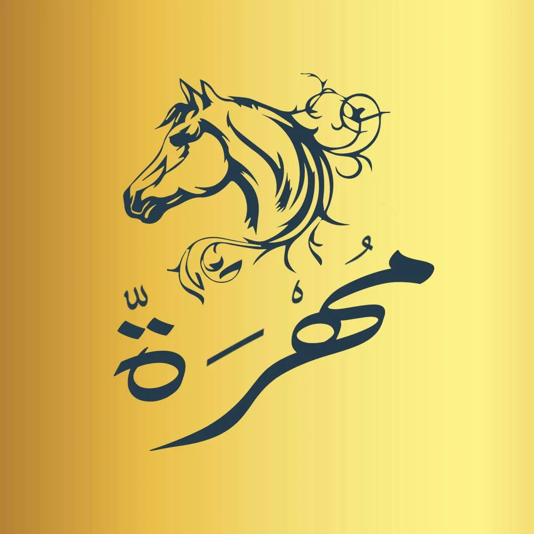
Mahra — مهرة — means a young mare.
So the mark is a horse in profile. But the move that makes it work is what happens to the mane: it is drawn as flowing fabric, which puts the product inside the symbol rather than beside it. A scarf brand whose logo contains a scarf, without ever drawing one.
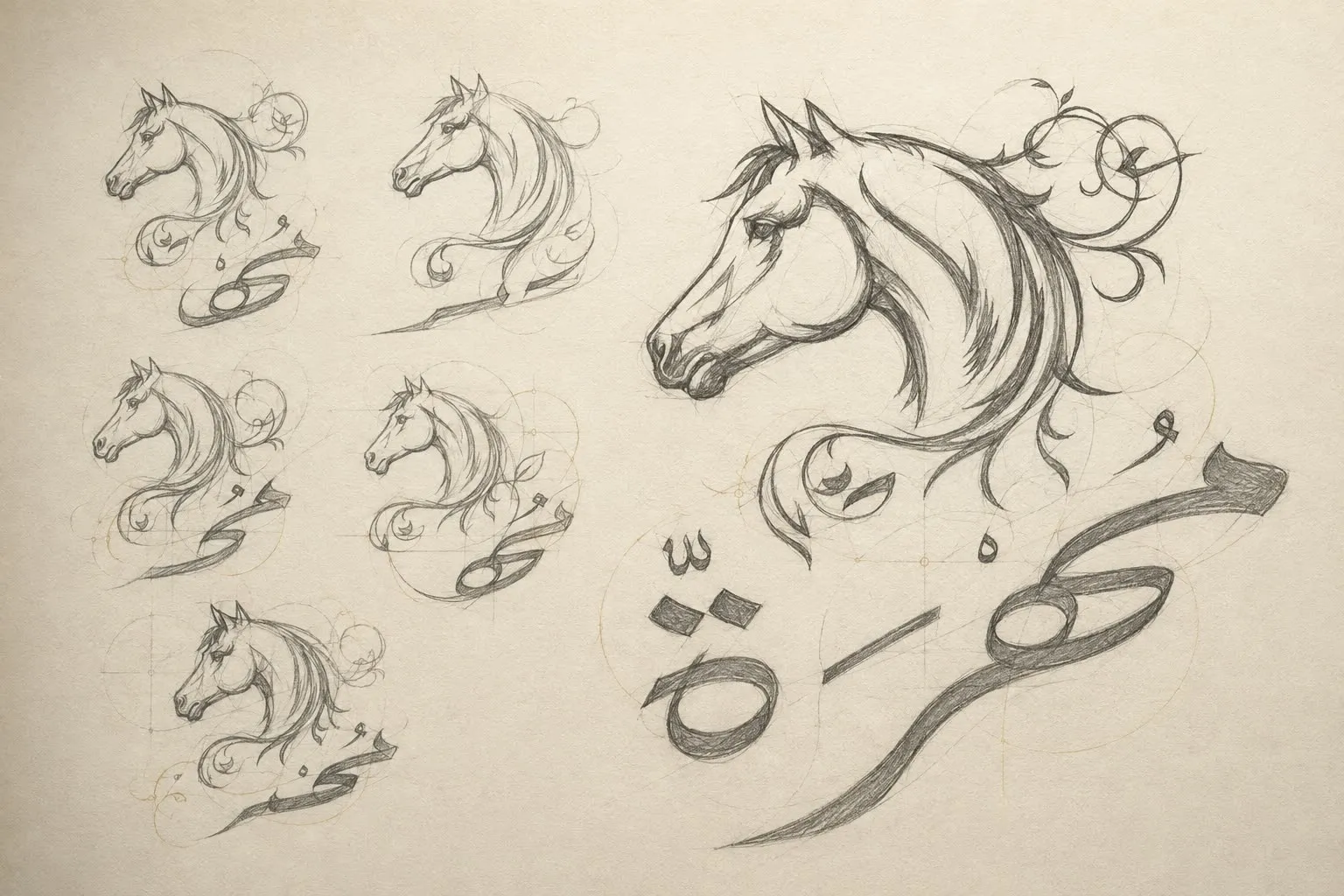
Three ideas run through one uninterrupted gesture: a feminine profile that gives the mark presence without aggression, the scarf-like mane, and the Arabic flow that ties the two together. The sketch page above is where that resolves — and it is the part of this project worth the most, because it shows the search rather than the result.
Bilingual by construction, not by translation
This is the most thoroughly bilingual thing in the portfolio: the deck runs English and Arabic in parallel on every single slide, not as a localised afterthought.
The type system pairs a serif for display with a sans for captions and product detail, chosen so both scripts hold the same optical weight — and clear space is defined as half the horse-head height, a rule that scales rather than a measurement that has to be remembered.
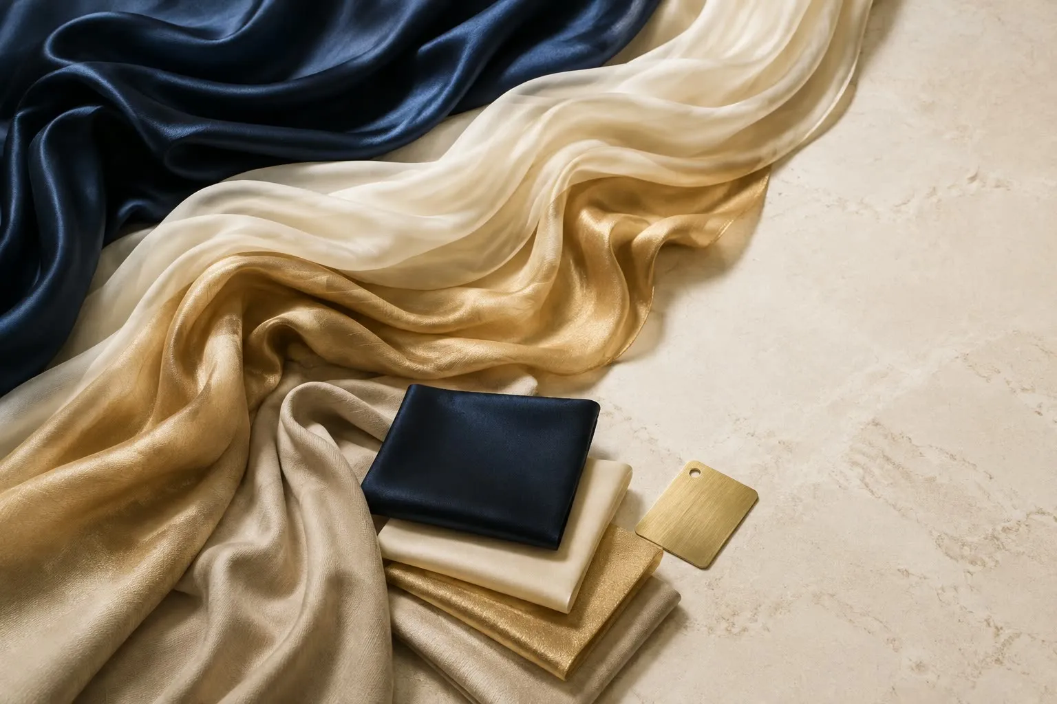
The palette is midnight navy and heritage gold over warm ivory and sand taupe: present and warm rather than cold and expensive.
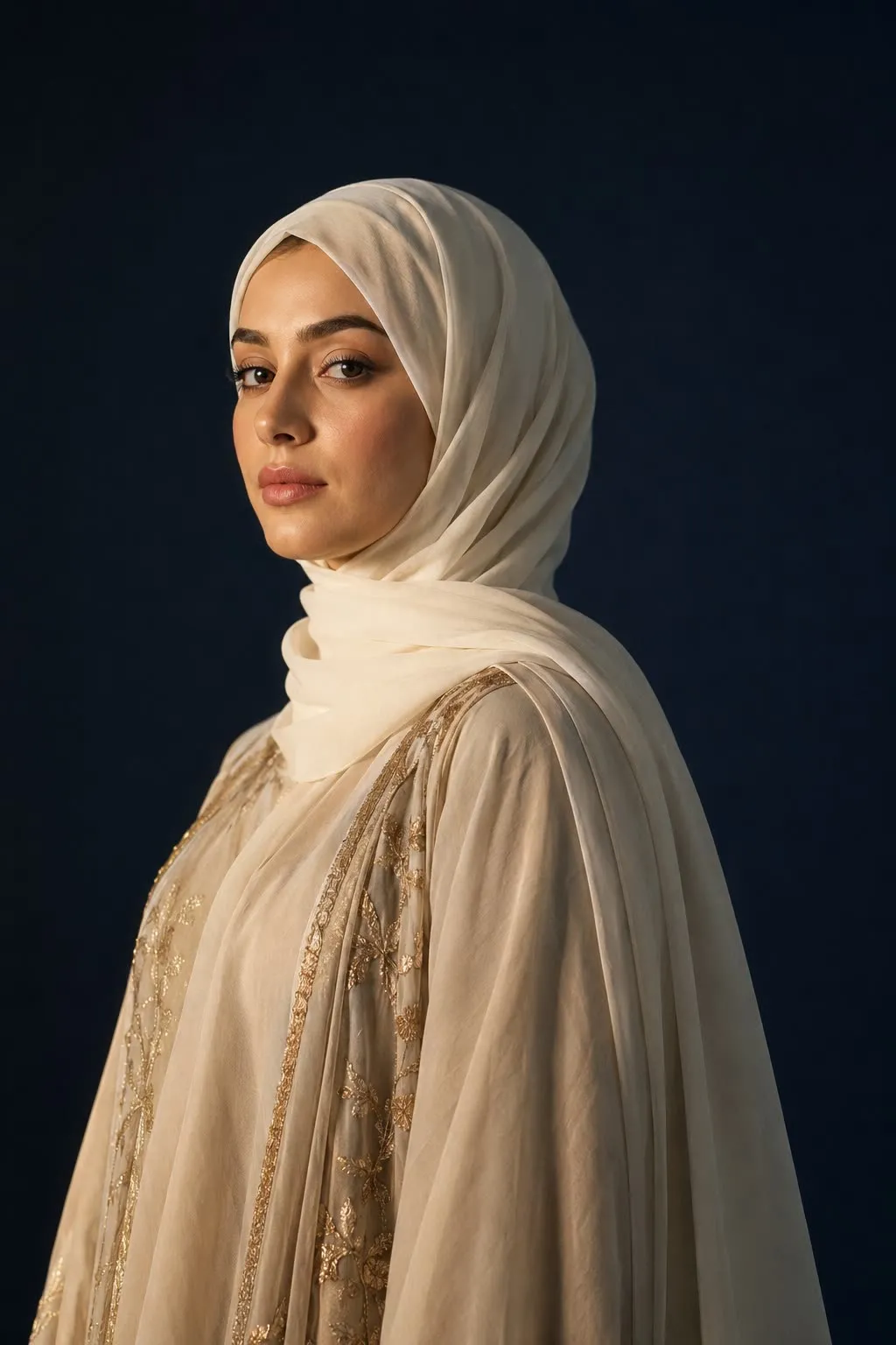
The brand line runs in both scripts too — “Grace in Every Fold” / “أناقة في كل لفة” — and the Arabic is not a translation of the English so much as the same idea found twice.
Where it lives
What shipped
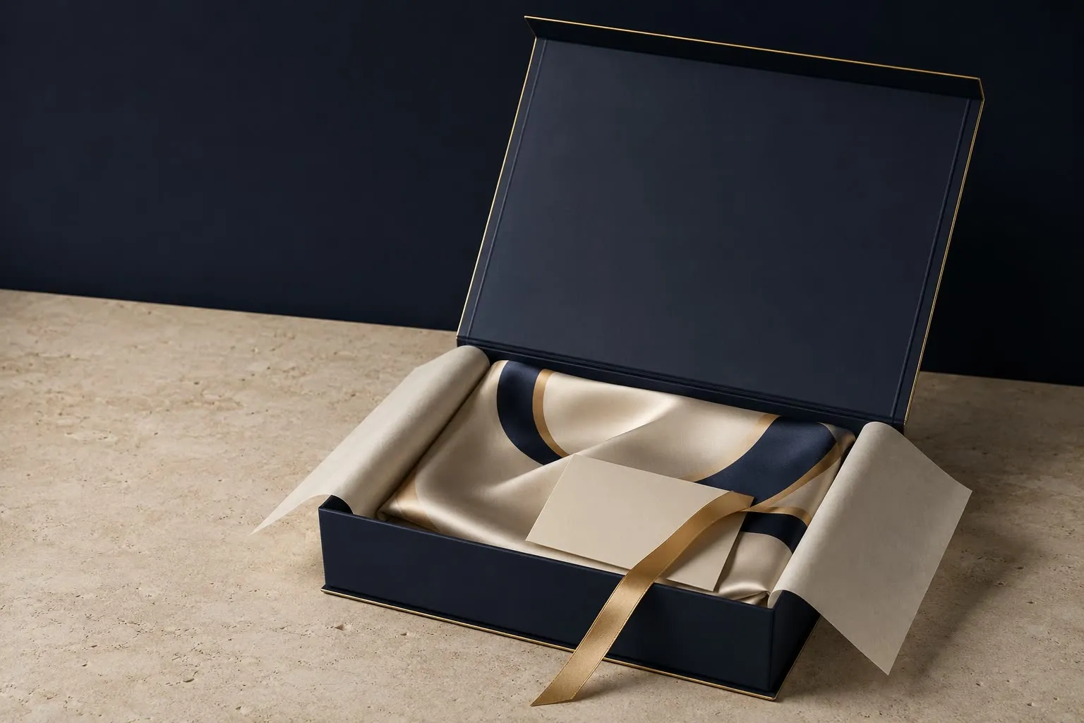
A bilingual identity: symbol, wordmark in both scripts, four lockups, a clear-space rule, a navy-and-gold palette, photography principles, a graphic language derived from the mark, and applications across social, packaging, retail and product detail.